Supercurricular

Friday, 19 July 2024

Politics in Rock

 The rock genre has a rich history of political messages, spanning back to the 1960s with the influence of Bob Dylan. 

Examples of bands:

  • Bruce Springsteen
  • Radiohead
  • Rage Against the Machine
  • System of a Down
  • KoRn
  • Metallica 
  • Megadeth
The band that wrote the song I’m using, System of a Down, regularly feature political commentary in their lyrics and videos. As an Armenian-American band many of these commentaries are critical of the US government and lack of aid in Armenia. ‘Prison Song’ discusses the US laws against drug use that specifically target POC citizens. ‘Protect the Land’ brings light to the ordinary citizens being forced to fight in Armenia. 

Because of this genre convention, I wanted to have political messaging in my music video and website. The song I chose features discussions of propaganda and corruption, which I would like to reflect in the video through comparisons of news and propaganda between two characters. I also want to include references to the 2024 General Election, specifically the social media campaigns of the parties. This will also be present on the website to tie the two together. 

Thursday, 18 July 2024

Test shots + location


Case Study 3 - My Chemical Romance

 I’m Not Okay (I Promise)

In this music video there is a fairly equal balance between the band’s performance and the narrative, with the two often overlapping.


This follows Andrew Goodwin’s music video theory with a link between the lyrics and visuals and intertextuality. Although no intertextual references to specific other media products, a certain level of cultural competency is expected to understand the general references to high school experiences and representation in the media. 


The flashing up text keeps the audiences’ focus as well as engaging in the personal identity aspect of Blumler + Katz’s Uses and Gratifications theory. 


This is clearly a music video for the rock genre with zoom ins on the instruments, focus on performance of the band and MCR are easily recognisable by their image. 


Planetary Go!

This music video is purely performance based, specifically a live performance, with lots of camera cuts on both the music and lyrical timing to retain the audience’s interest. 


There are multiple instances of key lyrics flashing up, often animated and covering the majority of the screen. Also, the members are introduced as they appear, akin to movies such as those Tarantino directed.


Although not following Andrew Goodwin’s music video theory in the same manner as their previous video, this video focuses on the performance aspect of the theory, likely in order to promote tour tickets. 


This again is clearly a music video for the rock genre with zoom ins on each band member and their instruments, live performance in front of an audience as the recognisable image of Gerard Way (the singer) in his ‘Danger Days era’ (categorised by his red hair after their album release). This easily places the music video in a timeline of the band for dedicated fans.


Website

Overall the website is very dark to fit in with genre characteristics of rock imagery and it is simple/easy for the audience to navigate and use.

Before the audience can enter the main website, they are taken to a page dedicated to the band’s latest release with links to listen to/watch it. 


The main page of the website displays the latest news from the band, including an intertextual reference to one of their songs. There are links to other pages such as merch and tour information. There is also a pop up to sign up for the latest news from the band, strengthening the relationship between the band and the audience. 


At the bottom of the website there are links to the band’s various social media platforms.


Case Study 2 - Misfits

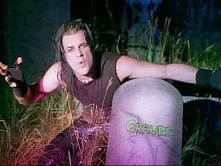
 Dig Up Her Bones

Although there is no real narrative, the pace is still kept by switching between live performances of the band, lip-syncing from the singer in a second location, and the intertextual clips. Cuts in shots follow the pacing of the lyrics rather than the instruments. 


The music video follows Goodwin’s theory of music videos, with links between the lyrics and visuals, links between the music and visuals, Intertextuality, etc. There is a heavy sense of Intertextuality with direct clips from Frankenstein being edited in, linking in with the lyrics and general image of the band. Further intertextuality is seen with members of the audience wearing the band’s merch in the 


This is clearly a music video for the rock genre, with skeletal imagery, live performance aspects and zoom ins on instruments being played.


The mise-en-scene of the lip-syncing shots clearly link in with the lyrics.


Website

Overall the website contains a lot of imagery from the band, mainly their logo, creating a sense of coherency. 

I really like the quick links format and will use it as inspiration for my website. There are clear links to news, tours, social media, fan sight, etc. There is also imagery from the band and their albums. There is a clear colour scheme seen repeated across the website.


The website also has more links to key pages, such as the store and tour dates, as well as a mailing list the audience can sign up to to feel a closer/more personal relationship with the band. Again there is lots of imagery of the band. The colour scheme of black, red and white is continued here.


As the band is no longer active, the website has an archive of their past tours and festivals. Also, the background is a repeating motif of their logo

Wednesday, 17 July 2024

Case Study 1 - Green Day

Basket Case


This music video has a fairly equally balanced level of performance to narrative, with the two even often overlapping. There are plenty of zoom-ins and different camera angles of the band playing their instruments or singing. The change in shots is in time with the music, eg on a chord progression. 


Although lacking in Intertextuality, the band is clearly recognisable by the codes of costumes and body language. 


The music video follows Goodwin’s theory of music videos with clear lip-syncing, images reflecting lyrics, etc.


This is clearly a music video for the rock genre, with a focus on guitars and the leader singer, over-exaggerated facial expressions, violent narrative features and the costumes. The busy mise-en-scene keeps the audience engaged in an otherwise repetitive shot of the band performing.


Website

Overall, the website has a clear colour scheme and is very cohesive across the different pages with their layout, font, etc. 

The first thing on the website is a link to their current tour, encouraging the audience to buy tickets. There is also links to other pages of the website such as merch, a sign up option, etc.
Scrolling down, there is a few examples of embedded music videos that can be played on the website or there is a link available to take the audience to their YouTube channel in order to stream the video. This benefits the band by gaining them revenue from YouTube plays. 
Scrolling down again reveals the tour dates with direct links to each individual show on the tour, again encouraging the audience to purchase tickets. By specifying ‘low tickets’, the band is playing on the audience’s fear of missing out and not being part of the community. 
Finally (apart from a set of quick links right at the bottom of the website) there is embedded merchandise with a link to their merch store and their coffee company. 

Thursday, 11 July 2024

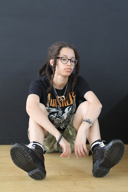
Photoshoot Shots


- individual meet the band shot
- i like the composition of this shot and the direct mode of address 
- i will crop the top and edit out the marks on the background
- individual meet the band shot
- i like the flow of the model here and the subverting gaze
- i will crop the top to bring more focus on the model
- i am not very happy with the creasing of the background so may attempt to fix this in photoshop
- individual meet the band shot 
- i like the flow of the model’s hair and the contrast of the grey outfit with the white background
- i may slightly crop the top and bottom to bring the model into the centre of the shot
- potential front cover for a magazine subscription as a merch option
- i like the pose and direct mode of address
- the plain background and space around the model could work well for magazine composition 
- individual meet the band shot
- i like the pose here and the facial expression portrayed by the model
- the contrast between the wall and floor brings more to the shot than a completely plain background does
- i will crop the top of the shot to better centre the model
- individual meet the band shot
- i like the dynamic posing and camera work of this shot
- i like the direct mode of address despite the face not being the main focus of the shot
- i may try to edit out the school in the gaps between the stairs
- individual meet the band shot 
- i like the background of the flowers but the houses are not ideal 
- i like the pose and the subverting gaze
- individual meet the band shot
- i like the codes of body language and subverting gaze
- i like the mise-en-scene (garden but not bright + colourful) but the houses are not ideal
- potential front cover for a magazine subscription as a merch option
- i like the pose and direct mode of address
- the plain background and space around the model could work well for magazine composition
- may crop the top slightly if the space is not needed for text
- miscellaneous shot
- i like the pose and direct mode of address
- i like the dynamic camera work
- may crop the top and left to bring more focus onto the model


Monday, 8 July 2024

Contact Sheet

- experimenting with angles for this group shot


- would change the angle for this shot to be more forward facing and have baggier clothes to flow with the pose


First Draft

 https://18-acol.wixsite.com/monstrosity ^ link to my website https://vimeo.com/1022470677 ^ link to my music video on Vimeo